EasyCanvasPrints.com is an E-commerce site that allows customers to print their personal photography on a variety of home decor products.
The brand has seen much growth and success, but the homepage fails to reflect the sentimental brand customers have grown to love. Based off of my research, I had found that the homepage fails to offer any quality info about what products we offer and what they look like in the context of your home. It was clear that the site needed a visual overhaul when it was often being described as visually “cold”.
In the month of May, 2019, I lead the redesign of the homepage which focuses on a warmer more photographic based layout and gives customers the information they need when deciding on whether to shop with EasyCanvasPrints.com.
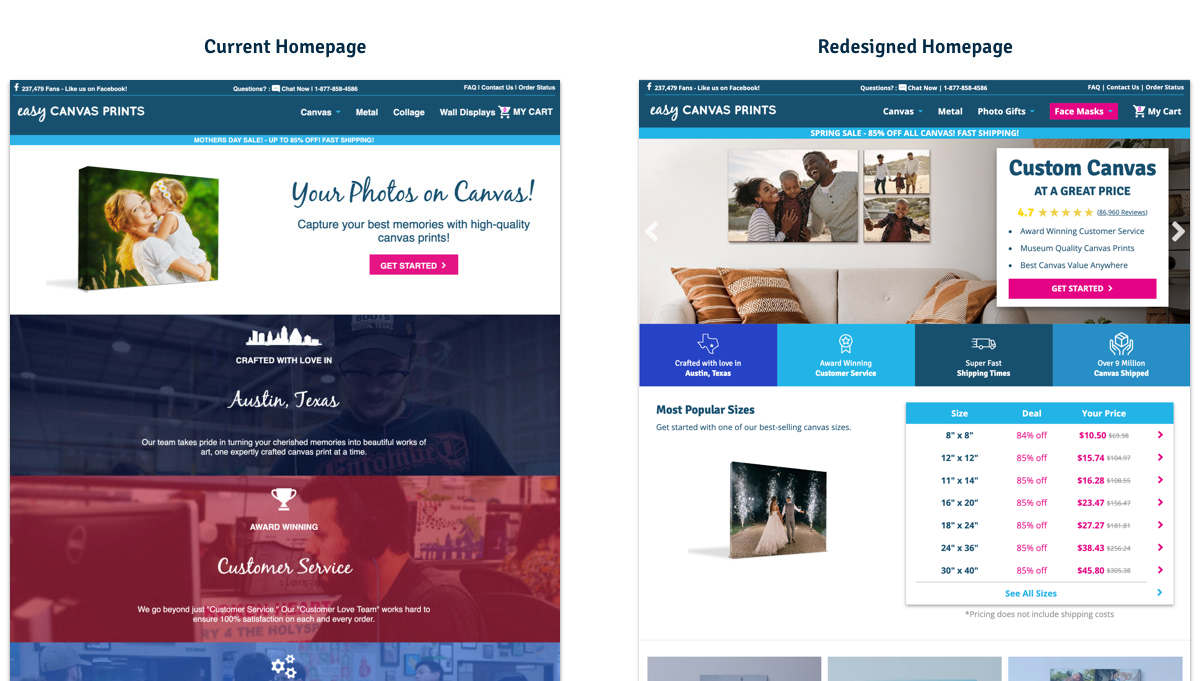
Current Homepage vs Redesigned Homepage
Challenge
Redesign the homepage to better reflect our brand, and allow room to grow as we continue to expand our product base. Currently the site converts very well on all devices, despite the homepage being one of the lowest converting pages throughout the whole site.
Team
Edward Rendon - Lead Designer & Researcher
Darin Carter - Visual Design
Laura Worrick - Art Direction
Date
May 2019
Tools
Sketch, Usertesting.com, InVision, Photoshop, Adobe Dimension
Design Goals
- Brighter/Friendlier/More Feminine through photography
- Emphasize "Custom" (Sizing/Framing/Material)
- We are local, and cost efficient without sacrificing quality
- Customer focused and loved (40K Reviews)
- More product info
- More call to actions throughout the page
- Room to grow (More products coming soon)
What Our Customers were Saying
- "It's visually bland/cold"
- "It's not ugly"
- "I like that it's from Austin and they focus on customer service"
- "It looks like they sell canvas.....?"
- "What does the product actually look like?"
- "What is the actual quality of the product?"
CUSTOMER USE CASES
- Gifts for grandparents who live far away
- Decorating the house with something personal
- Printing out vacation photos
- Printing out life's most important moments like your wedding or the birth of your child.
RESEARCH
For this design project, I introduced UX research earlier than I normally do for In-House projects. Before wire framing, I conducted interviews based off of customers' needs during the Canvas buying experience. I found that there were three main things customers cared about specifically for buying canvas.
1. Quality
2. Durability
3. Price
Wireframing
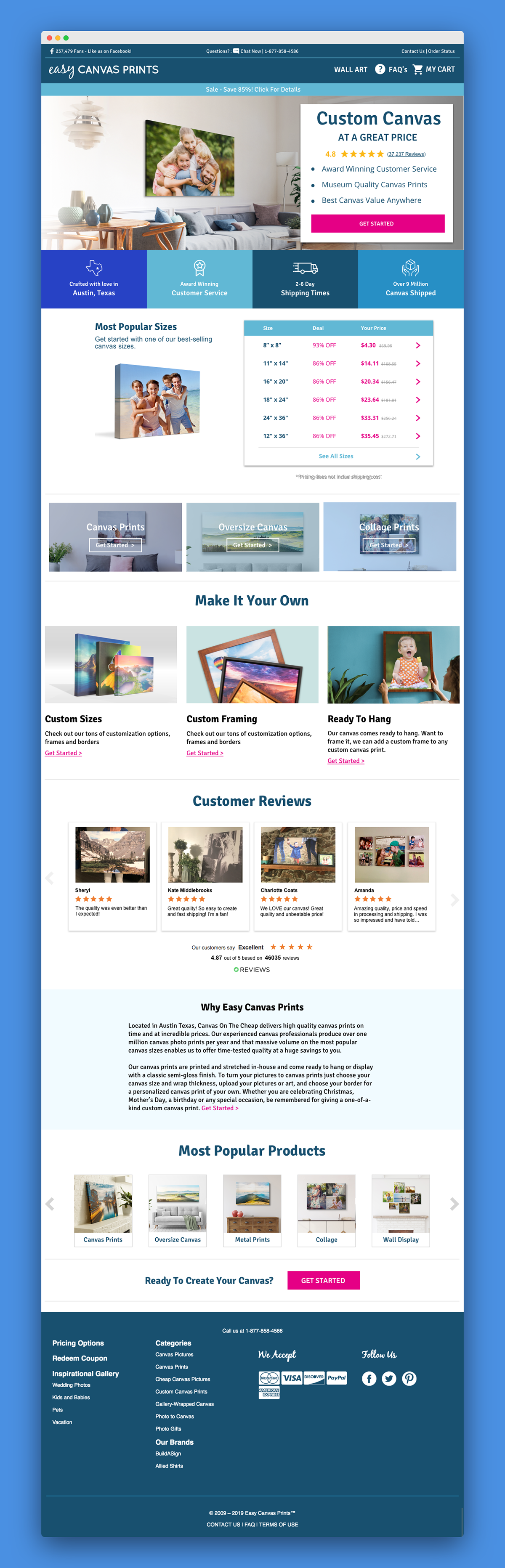
One of the main goals in the redesign of this page was to make the site feel more human and less "cold". Without dramatically changing the brand, I wanted to achieve that visual tone by including a lot more photography of canvas in homes. Photography was included in the wire framing stage very early on in the process.
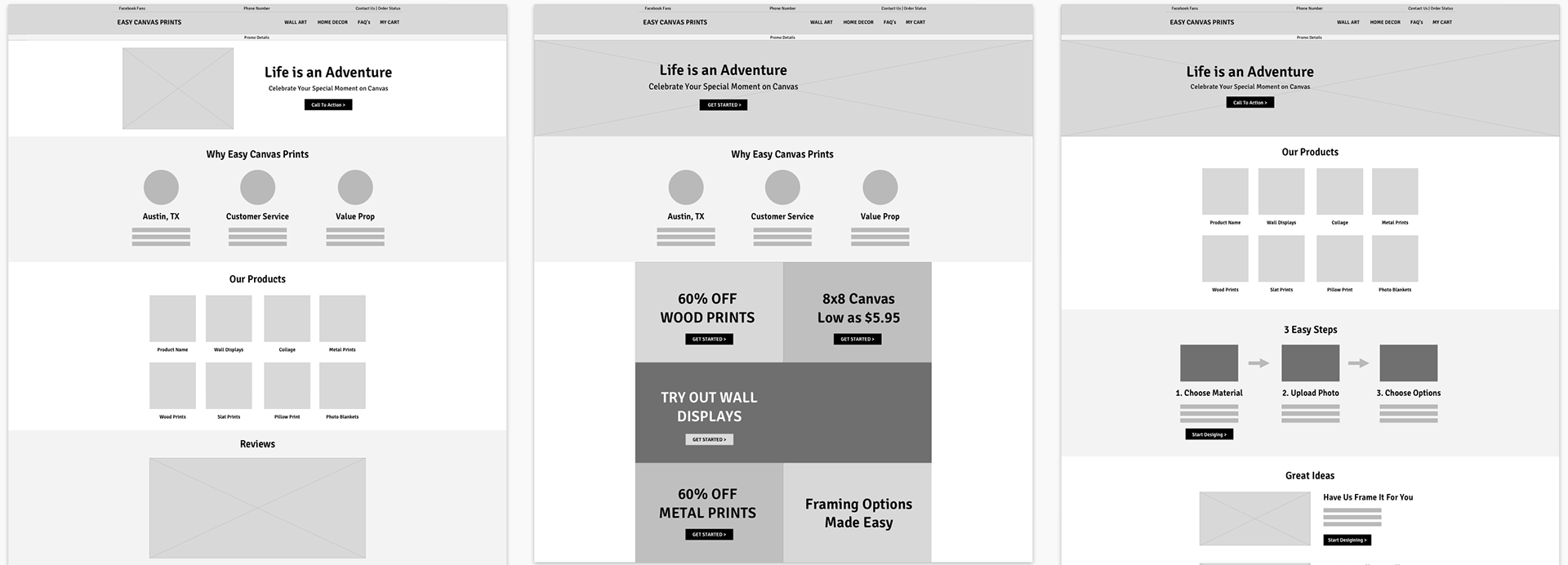
Early wireframes of the homepage
Early concepts of content units
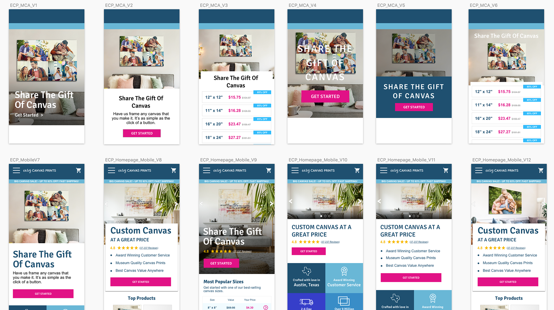
Different Main Campaign Area iterations
Giving Customers Context
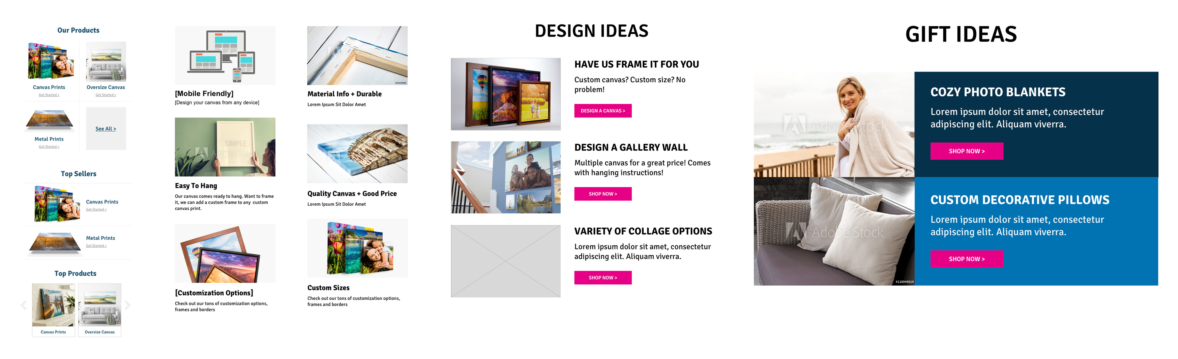
During user testing, customers were commonly unclear as to what the product looked like in real life. Quality and durability were two of the most important things to customers when buying canvas. We wanted to let customer testimonies speak to the quality of the product with photographic evidence to back it up.
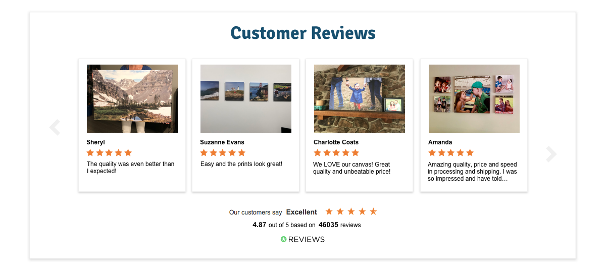
Reviews combined with photography gave customers context to how our product looks
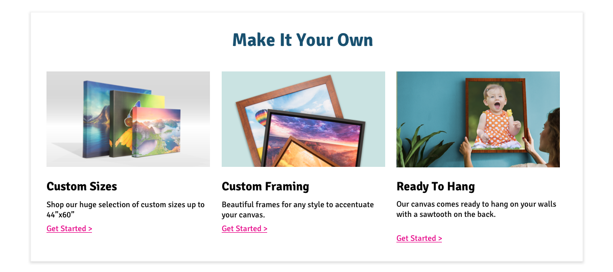
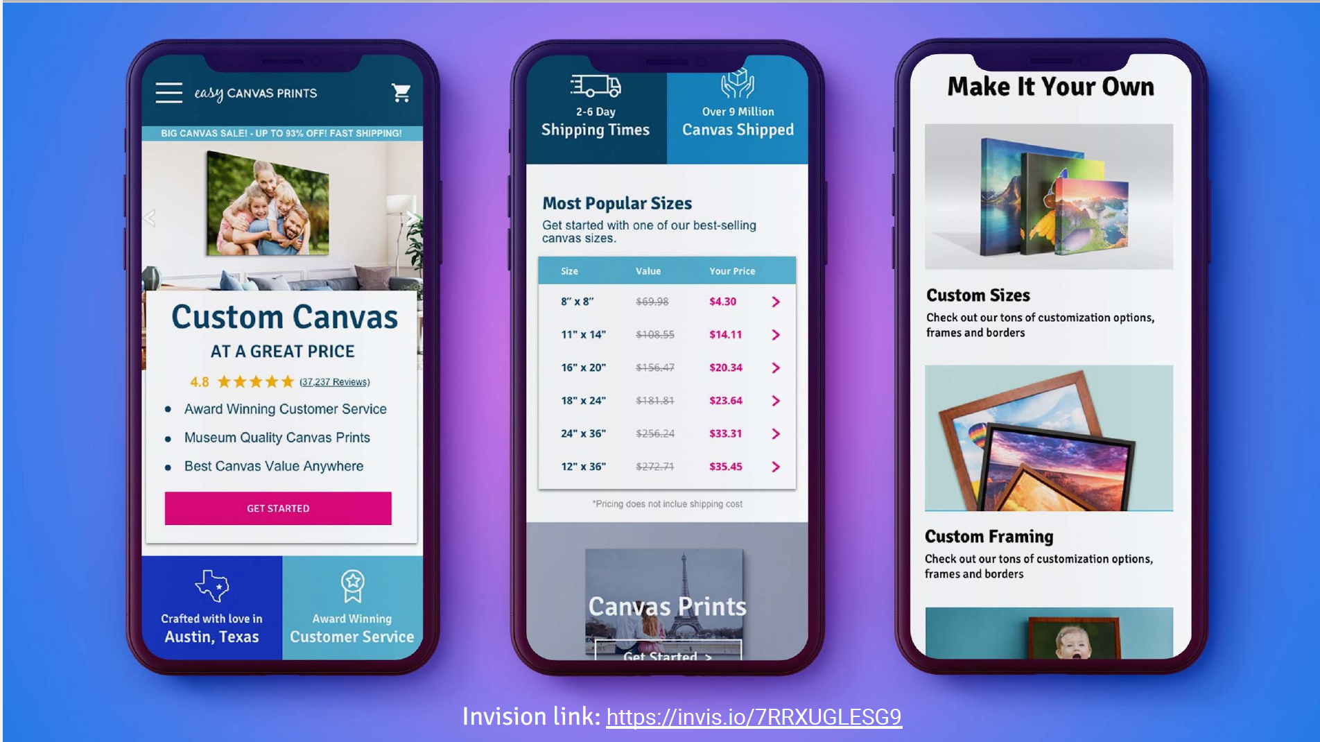
A Truly Custom Product
There are a lot of customization options that are not clear to a customer until you're halfway through designing your canvas. We wanted to show some of those value props at the very beginning of the customer flow.
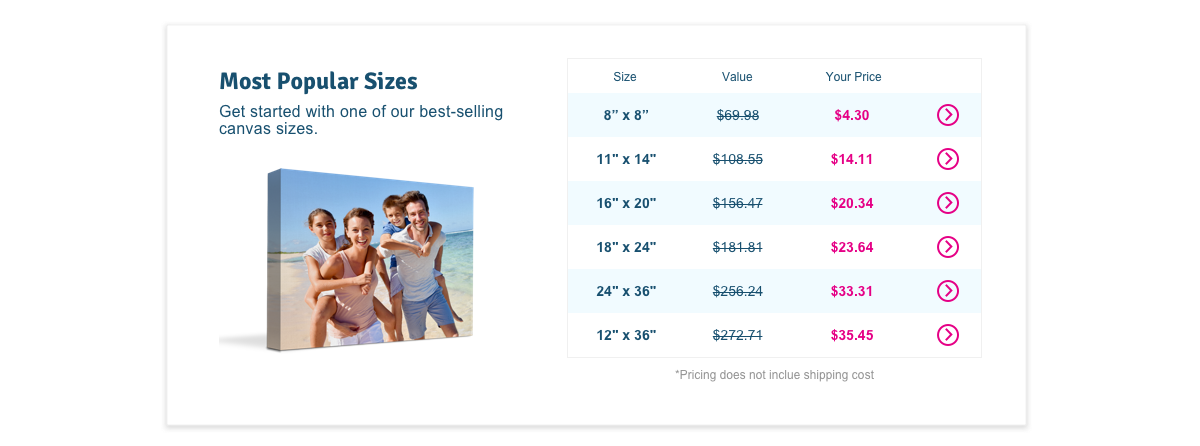
Transparency of Price
Including a pricing chart on the homepage showed the wide variety of canvas sizes the site offered and how affordable the pricing is.
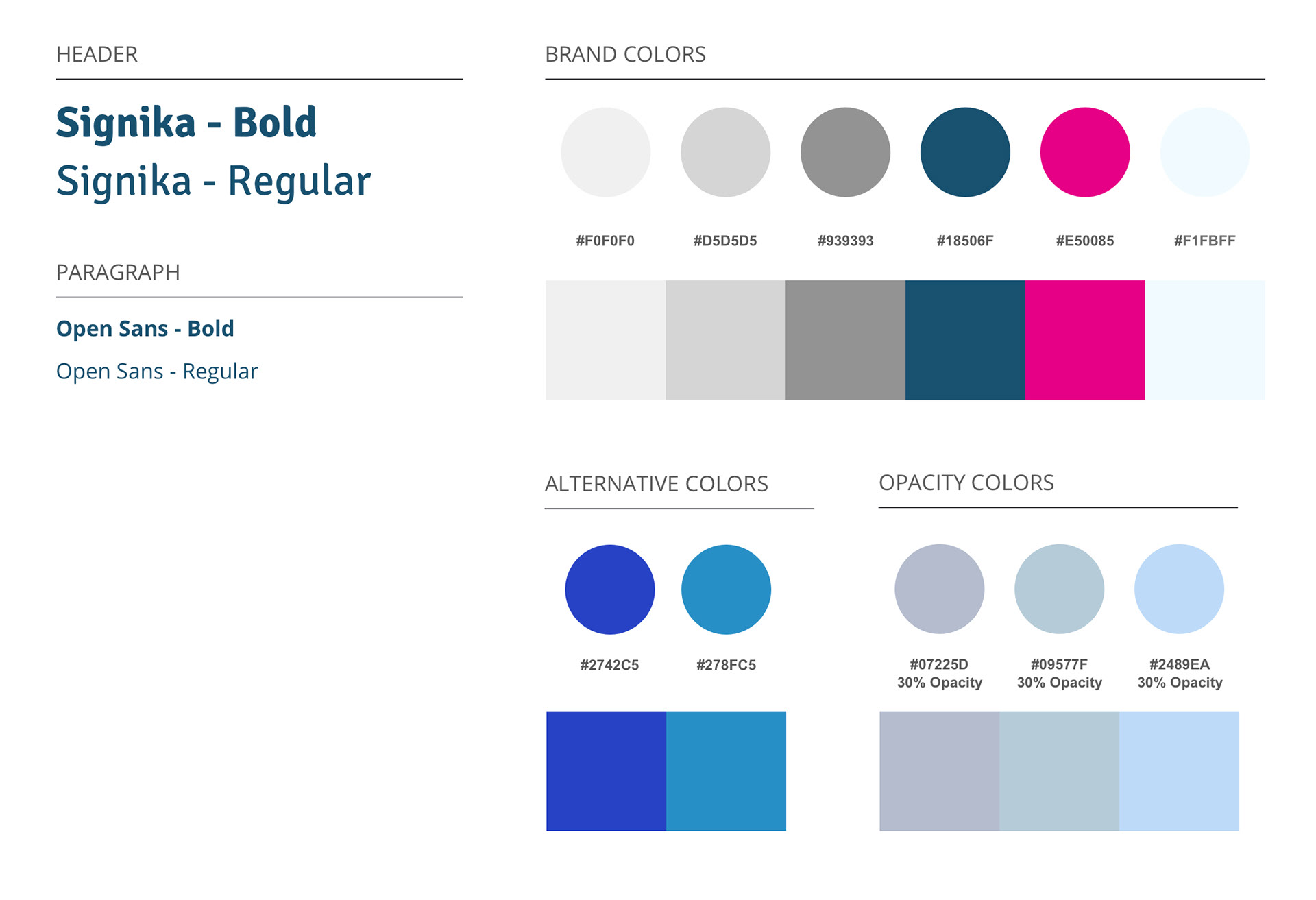
Styleguide
There were two big changes to the styleguide.
1) New Typeface
The paragraph text changed from Arial to Open Sans. We wanted to have a typeface that breathed more with a lot wider character width.
The header text changed from a cursive font named, blackjack, to Signika. The previous text was illegible because of the cursive. With the new typeface choice, we were looking for something that was cleaner and more legible but still had some character to it.
2) More Colors
On the previous style guide of Easy Canvas Prints, we had a very limited palette that is labeled "Brand Colors" below. When testing what customers thought of the visual style, they would say that colors were clean but a bit cold. I wanted to add a couple different blues that were more vibrant to add some energy to the page for a brand that is sentimental and should never be perceived as cold.
Final Designs
What Our Customers ARE NOW Saying
“You can really customize [The Canvas] in a number of different ways!”
“Great family photo in their living room”
“High ratings… I’m going to get a great product. This is something I should buy.”